NFIB is a nonprofit, nonpartisan, member-driven organization that advocates for small-business owners throughout America. For more than 75 years, NFIB has fought for the interests of independent owners. From healthcare to taxes to business regulations, NFIB provides support to small-businesses.
The client needed a complete redesign of their website. With more than 100+ existing pages, this was a very heavy lift. In order to optimize, we had to rebrand and build a design system that was intuitive—one that utilized fluid modules, flexible components, and smart color system.


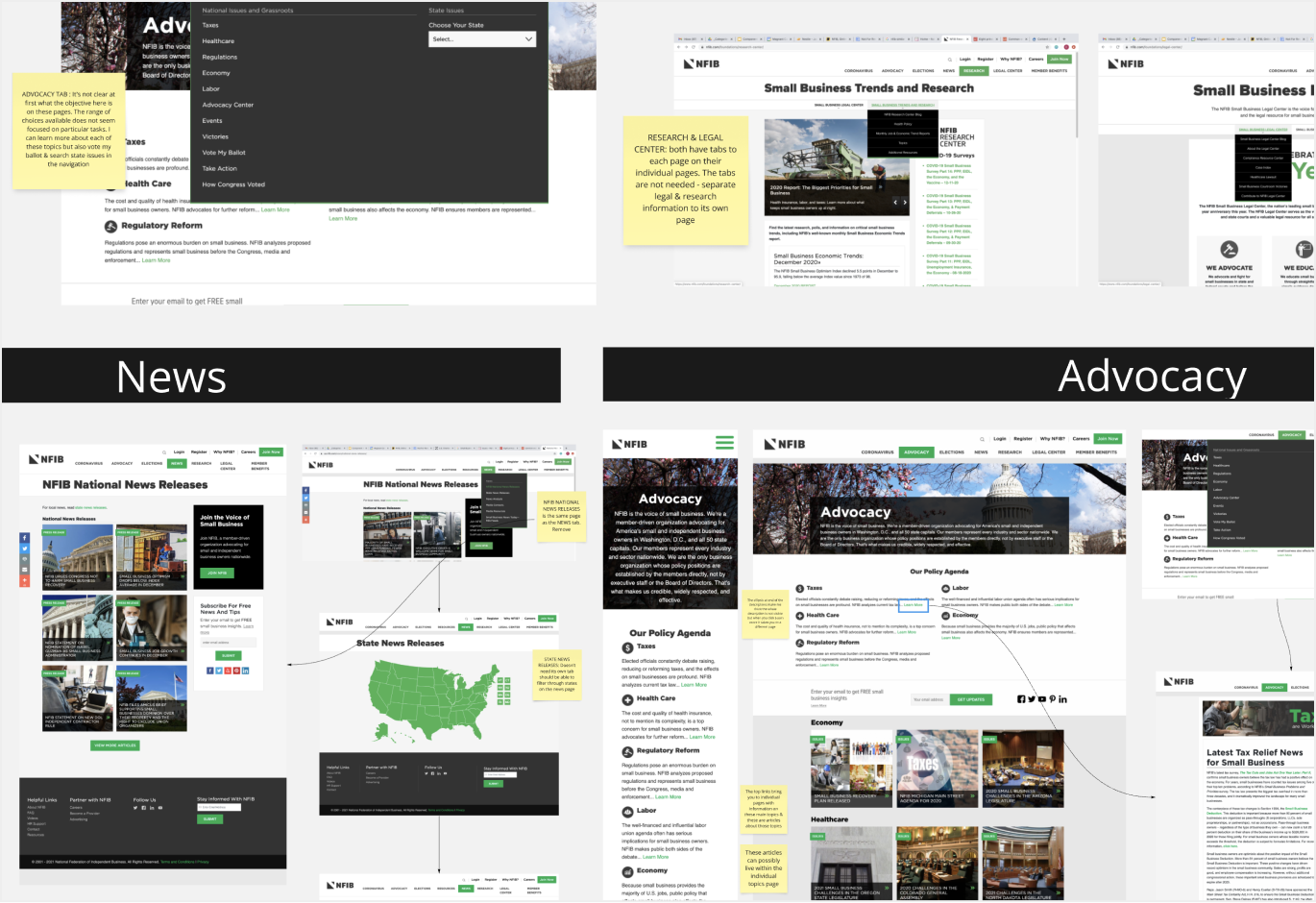
We worked closely with the UX team to assess the current condition of the site. Miro was an important collaboration tool during this process. UX first did an extensive audit of the current user flow; taking notes of areas that needed improvement or that felt unnecessary. After the audit, we created low and high-fidelity wireframes.
We found weaknesses in their old design system that was affecting the overall user experience—with little to no differentiation between interactive and non-interactive elements, it was unclear where the user could continue with the experience; overall navigation system was confusing and difficult to scan; color palette made it hard to differentiate between important and non-important elements etc. These gaps in their design were important for us to consider when rebuilding their design system.


Seeing how the use of color was affecting the user experience, our first step was to optimize the color system. The color palette from NFIB’s previous branding was very simple. However, we found accessibility issues with their shade of green (#00AD50). We explored slight variations of that green to make sure it passed a 4.5:1 ratio. And to ensure that we were fully covered, we explored a wide range of green tints that would pass accessibility on a variety of background colors.


Here’s a quick peek into how we utilized color tokens which would help streamline our variable collection. Not only would it enhance our design system, but this naming system is comprehensible for both developers and designers which would allow for a smoother dev-handoff.
Here is the general naming system we used:
Element-Category-Concept-Property-Variant-State
By assigning these color variables at a component level, we were able to seamlessly switch out color themes for both modules and entire pages.

Using those components we were able to build a wide library of pre-built modules, all with flexible use cases. We wanted to treat these modules like building blocks—they could easily stack and be swapped out with others. Following a strict color ratio was important to ensure an optimal experience. We preserved the use of green for the CTA’s or sections that needed to be emphasized.

With our extensive module library, we were able to swiftly build new pages. Having the color variables integrated into the system made for a more flexible and streamlined experience.

Essential pages were designed in multiple viewport sizes: Extra Small (320px), Small (692px), Medium (1004px), Large (1308px), and Extra Large (1692px). This was most useful for the development team so they could easily visualize how the design adapts with the viewport size.


With the refurbishments, we we're able to create a structured yet adaptable system that would streamline our design process and allow for a smoother hand-off to the development team. Overall, the client was satisfied with the rebranding and the additional improvements to accessibility.
If interested in viewing the finished product, the live site is linked below!